
Gestalt principles play an important role in logo design, influencing how people perceive and remember brands. By applying concepts such as similarity, proximity, continuity, and figure-ground, designers can create logos that are attractive and easy to understand and recognize. These principles help organize complex visual information, making logos more effective in representing a brand’s message. Famous examples like the FedEx and WWF logos demonstrate how Gestalt principles logos contribute to successful brand identity.
Why is it so difficult to create a memorable logo?
Well, the solution lies in applying gestalt principles.
Indeed, Gestalt logos significantly impact how people view and understand business identities. They are psychologically based and examine how our brains organize and process complicated visual information.
When Gestalt principles, such as similarity, proximity, and figure-ground, are incorporated into logos, they become more effective. They can also make brands easier to recognize and remember.
The Design Council found that brands following these guidelines increased customer recognition and brand trust by 20% and 15%, respectively.
FedEx’s mark is an example of how Gestalt design can be applied. It cleverly uses the concept of continuity to add an arrow between the “E” and “x,” which stands for speed and accuracy.
In this article, we’ll figure out-
- Gestalt Principles: What Is This?
- Top 5 Gestalt principles in logos
- Example
Please read on!
Gestalt Principles: What Exactly Is This?
Usually, Gestalt principles are foundational theories in human perception that describe how we naturally organize and interpret visual information.
Usually, a German word for shape or structure describes how our minds perceive shapes as wholes. Since then, these rules have become basic ideas in design, especially logos.
Max Wertheimer, Wolfgang Köhler, and Kurt Koffka were German psychologists who developed Gestalt concepts in the 20th century. When presented with a disorganized picture, people naturally look for patterns and order, which they find. See here
These principles are not only theoretical but practical. The American Psychological Association found that Gestalt-based visual designs are easier to understand and remember.
Also, it uses principles like similarity, proximity, and closure. Designers can use these principles to make logos that are more than separate components.
For example, the principle of similarity explains that we tend to group objects with similar characteristics, such as color or shape, into coherent sets. This principle is commonly applied in logo design to create visual unity and coherence.
Top 5 Gestalt Principles in Logos
We have already pointed out the importance of Gestalt principles in designing effective logos. Using these principles, designers can create logo gestalt that are not only attractive but also easy to understand and remember.
Each principle helps to guide the viewer’s perception, ensuring that the logo delivers its intended message.
Let’s review the top 5 Gestalt principles and see how they shape successful logo design.
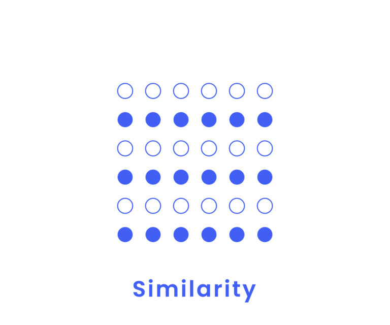
Principle 1: Similarity
In this concept, similar objects—such as those with the same shape, color, or size—are considered related or connected. Logo designers can use this principle to create consistency and pattern recognition.
Gestalt psychology describes how people naturally group objects with similar attributes. This grouping can be based on external characteristics such as shape, color, size, or texture.
Example: Sun Microsystems Logo
The Sun Microsystems logo is a classic example of similarity in design. The logo consists of U and upside-down U shapes arranged in a loop.
Although these shapes are individually simple, their repeated arrangement forms a noticeable pattern. When viewed together, the shapes create the word “SUN” on all four sides of the shape, effectively conveying the company’s name visually.
By simplifying complex text into a memorable logo, the design shows how similarity increases brand recognition.
Essential Highlights
|
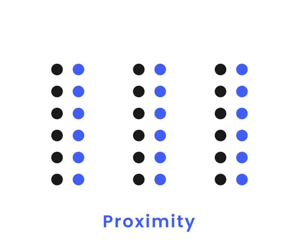
Principle 2: Proximity
‘Proximity’ is another fundamental Gestalt design concept. It emphasizes how spatial relationships affect our perception of individual elements.
When elements are placed close together, the human brain groups them as a single, unified entity.
This is even if the elements are distinct. Designers can create complicated images that look connected this way.
Example: Foodmobile Logo
The Foodmobile logo, designed by Nikita Lebedev, clearly expresses proximity.
There are several parts to the logo, each representing a different type of food that the mobile service offers.
Because these parts are placed so close to each other, they make the shape of a car when put together. The brain quickly combines each part into a single picture of a car, even though each part is different.
Essential Highlights
|
Principle 3: Multistability
Usually, multistability gestalt is a visual phenomenon where a logos can be interpreted in multiple ways. When viewing such logos, our eyes and brain can switch between different perceptions, but only one interpretation is dominant.
This creates a mental challenge as the viewer’s mind alternates between these interpretations.
In fact, the longer one focuses on the dominant perception, the more difficult it becomes to understand the alternate view.
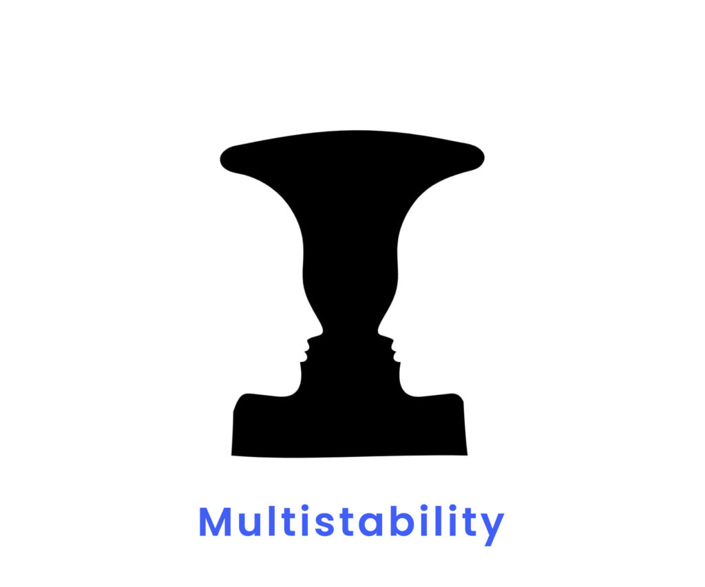
Example: Rubin’s Vase
Rubin’s Vase is a classic optical illusion and multi-stability gestalt example. This image presents a central shape that can be interpreted in two distinct ways:
- Simple, elegant vase
- Two Faces in the profile
By combining the negative space around the central, symmetrical shape, two faces look at one another in the Vase. Initially, viewers may notice either the Vase or the faces, but both at different times.
As they shift their focus or reconsider the image, their perception alternates between these two interpretations.
Even, as viewers shift focus and attention, the dominant perception shifts, supporting the principle of multi-stability.
Essential Highlights
|
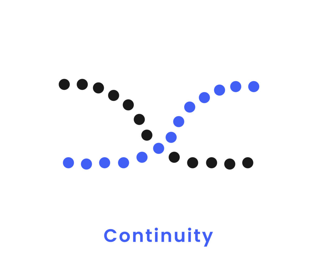
Principle 4: Continuity
When things are put along a line or curve, we see them as continuing past their clear ends. This is called continuity. When we see these lines and curves, our brains follow them without breaks.
We think they will keep going the same way until they meet another object. This principle guides the viewer’s eye along a visual path and gives design a feeling of flow and cohesion.
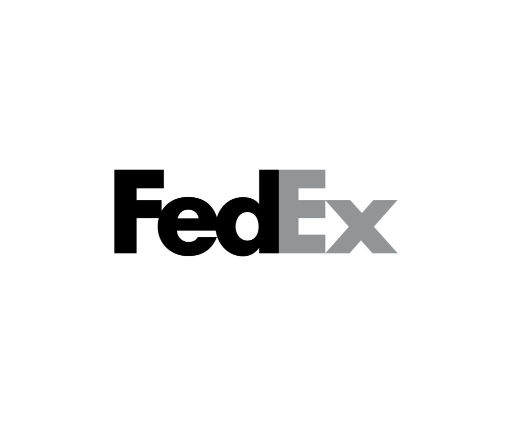
Example: FedEx Logo
The FedEx logo is an excellent example of how consistency works.
The mark, made by Lindon Leader, cleverly uses space to hide an arrow between the letters “E” and “x.” The arrow goes to the right, meaning things are moving forward.
There is a smooth flow of eye movement from “E” to “X,” and the hidden arrow fits perfectly with the rest of the design. With this small but effective use of continuity, the brand conveys a message of speed and efficiency.
A continuous line gives the logo meaning and makes it easy to remember.
Essential Highlights
|
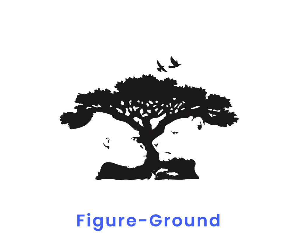
Principle 5: Figure Ground Rule
Well, Figure-ground principle is a design idea that looks at how a central part (the figure) and its background (the ground) relate.
This concept shows how the figure and the ground work together to give the picture depth and visual interest.
In real life, the figure is what the design is about, and the ground adds background or contrast. This interaction can make the figure appear more or make the ground a vital design part.
Often, designers use this idea to create images and logos in which the background isn’t just a blank area but an active part of the design.
Also, artists can create effects like hidden pictures, easier reading, and memorable images by cleverly arranging the figure and the background.
Designers can play with positive and negative space to enhance the viewer’s experience by making it richer and more lively.
Example: World Wildlife Fund (WWF) LOGO
Actually, it is easy to see how the figure-ground rule works in the WWF sign.
The mark is a simple but strong picture of a giant panda made by Sir Peter Scott. In this figure-ground logo, the panda is the image, and the background is the space around it.
The black-and-white panda stands out against the white background. However, the design also cleverly uses the white spots inside the panda’s body to create a visual balance that makes the logo stronger overall.
Also, it helps keep the image clear and easy to spot by interacting with the panda and its background.
By using figure-ground connections in the WWF logo, not only is the panda highlighted as the main feature, but its message of simplicity and protection is reinforced.
As a result, the logo is more meaningful to people and visually supports the brand’s mission.
Essential Highlights
|
So, how was the guide on Gestalt Principles in logos? We believe that you found the above post helpful. You’ve gained new insights into how Gestalt principles shape effective logo design today! If so, our efforts and your time have been well-spent.
You already know it’s challenging to create a memorable logo in a crowded market. But, it’s not impossible!
With specific and accurate guidelines, you can make a positive impression in the industry. Yes, Gestalt principles can make your logo distinctive and impactful! That’s why understanding these principles is essential!
Still, if you have questions about Gestalt principles in your logo design, contact us!
No more words, today! Soon, our team will bring you another essential guide to improve your design skills. Till then, stay creative and inspired.