The Brand Idea
Designed for a More Connected Financial World.
ROLE
Brand Identity Designer
SCOPE
Strategy & Visual Identity
BRAND DIRECTION
Clarity Through Connectivity
DELIVERABLES
Logo, Visual System & Guidelines
THE CONCEPT
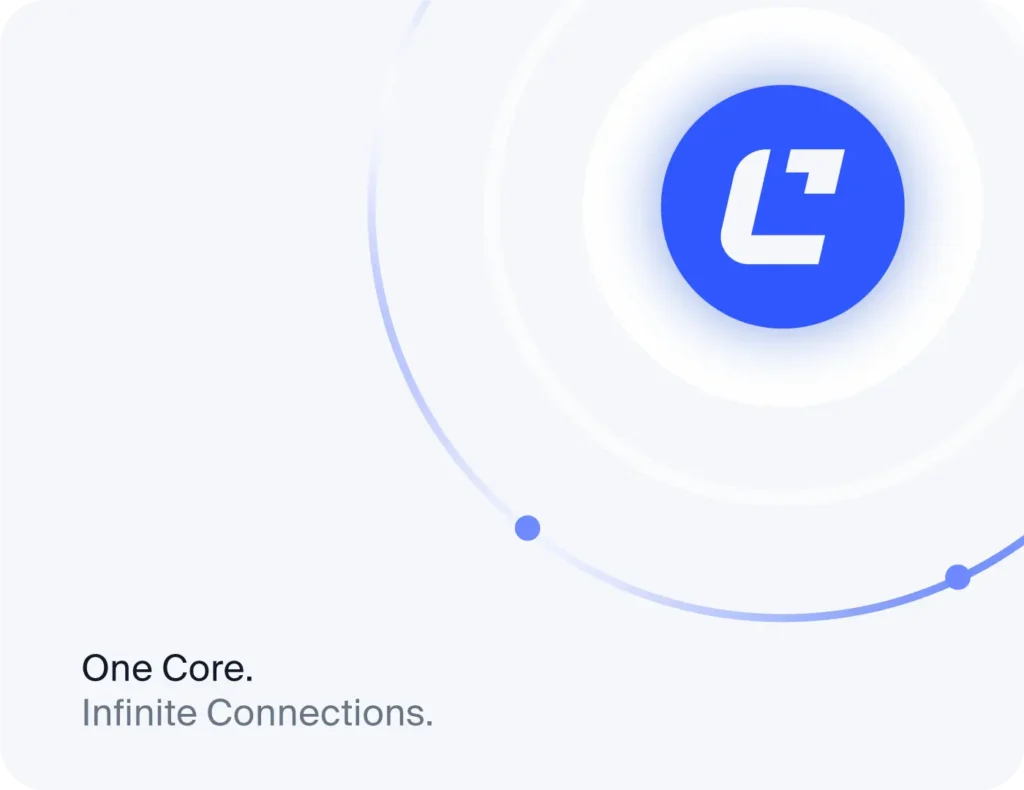
Cavora is a financial infrastructure brand concept built around connecting businesses, payment networks, banks, and global financial systems. The project explores how a distinctive visual identity can communicate clarity, trust, and global connectivity through a confident wordmark, a refined blue palette, translucent glass gradients, and a signature visual language inspired by connected financial networks.

BRAND POSITIONING
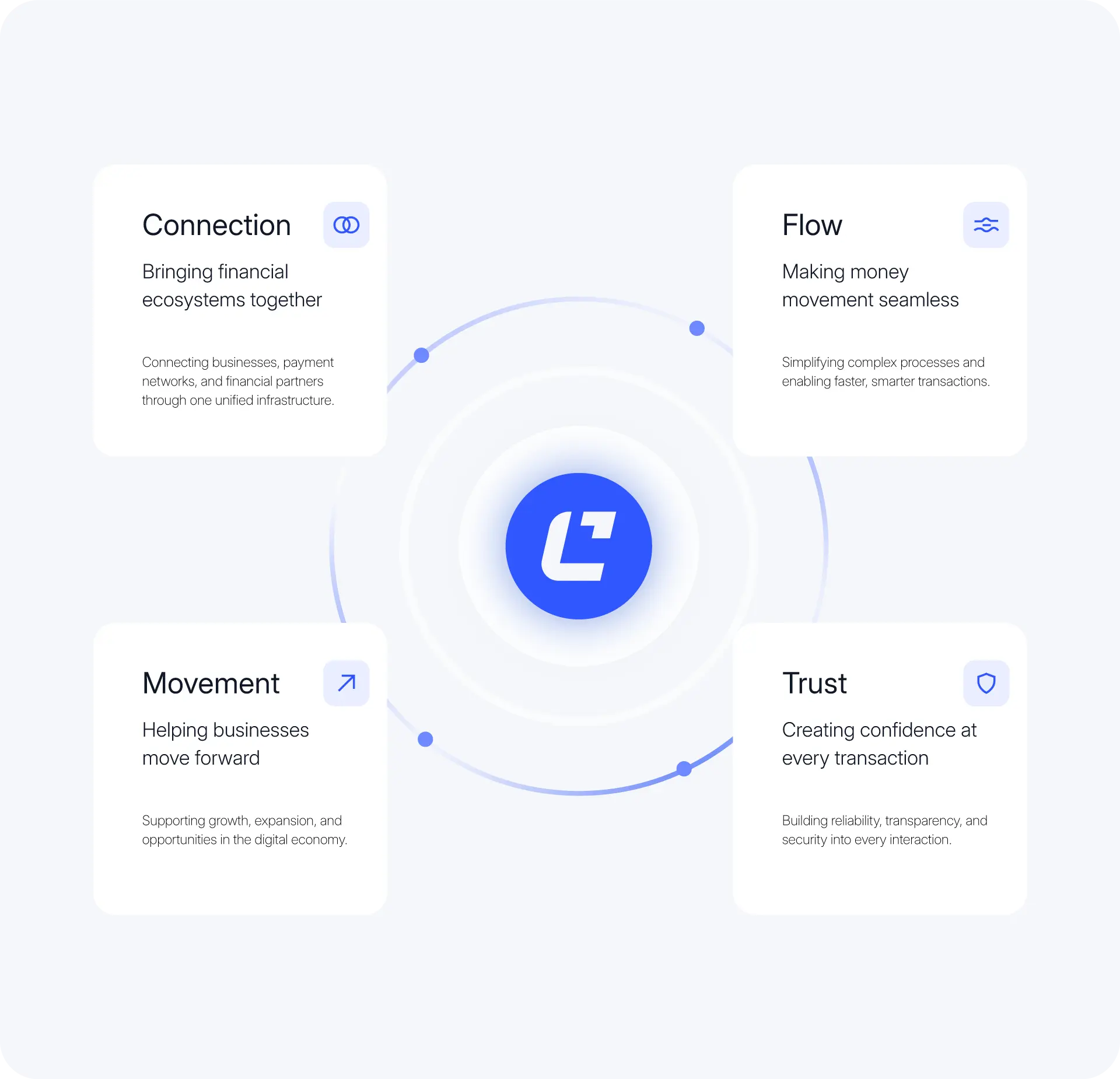
Cavora is a forward-looking financial infrastructure brand connecting businesses, payment networks, banks, and global financial systems through one unified ecosystem. Its identity communicates trust, clarity, and connectivity, making complex financial relationships feel more accessible. Built for reliability and scale, Cavora represents the foundation for a more open financial future.
Challenges & Solutions
Problem
Businesses moving money across borders depend on banks, payment networks, and financial systems that often operate in silos. This can make cross-border payments, settlement flows, and financial operations harder to coordinate and understand. Cavora needed a distinctive brand identity that could explain its role as a connected financial infrastructure layer while communicating speed, trust, and global reach.
Solution
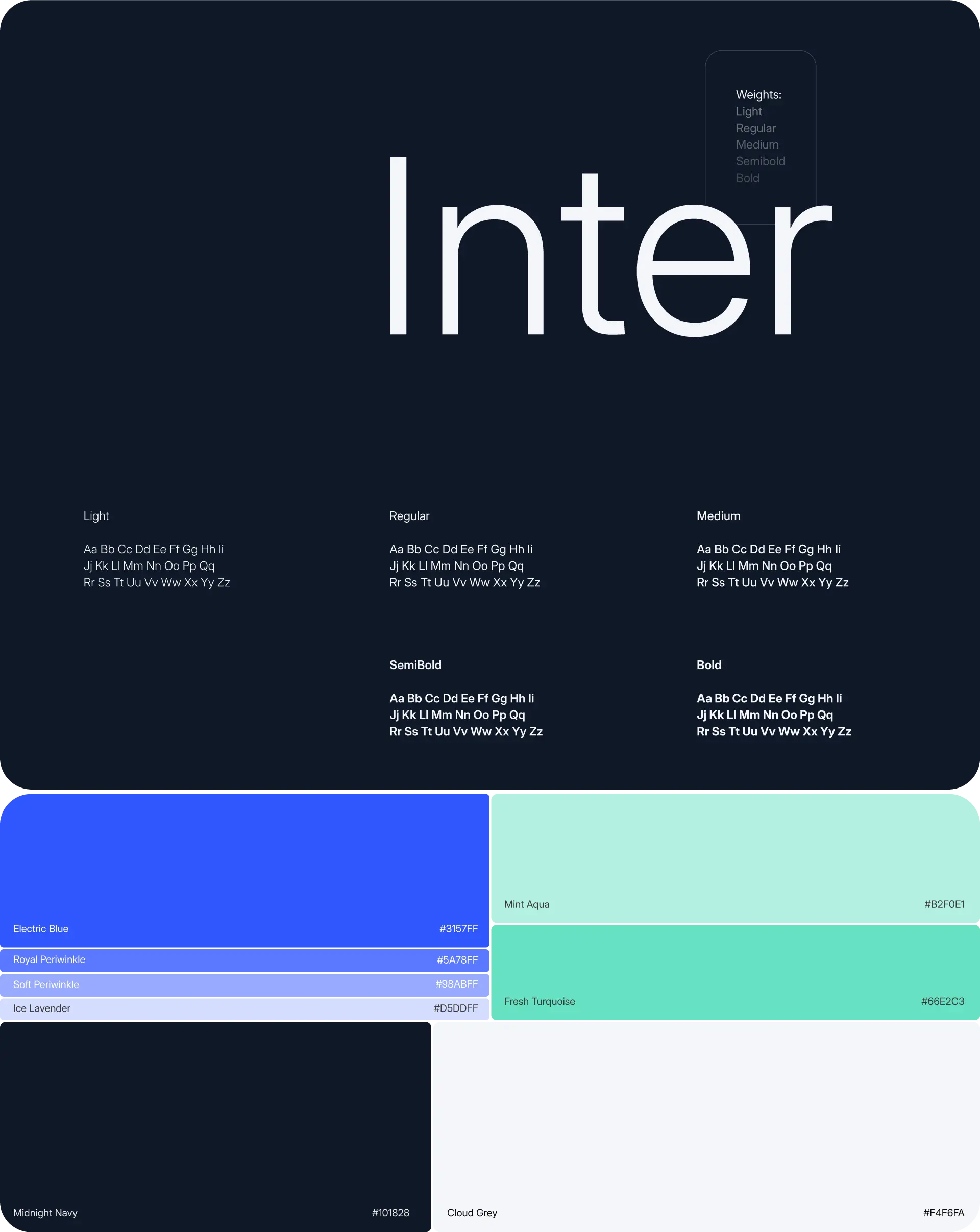
Cavora’s visual identity is built around clarity through connectivity. A distinctive logo, confident typography, and a palette of electric blue, deep navy, and soft neutrals create a recognisable foundation. Glass gradients, translucent forms, and connected visual patterns express movement between financial networks, helping position Cavora as a clear, dependable infrastructure brand built for global business.
Process
01
Discovery & Strategy
Market Research
Brand Positioning
02
Visual Exploration
Visual Direction
Moodboard Creation
03
Identity Development
Logo System
Glass Gradients
04
Design System & Applications
Color Typography
Digital Applications
Digital Experience
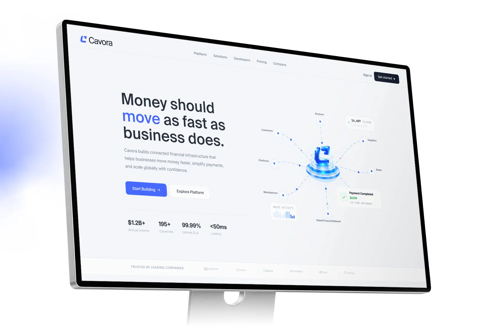
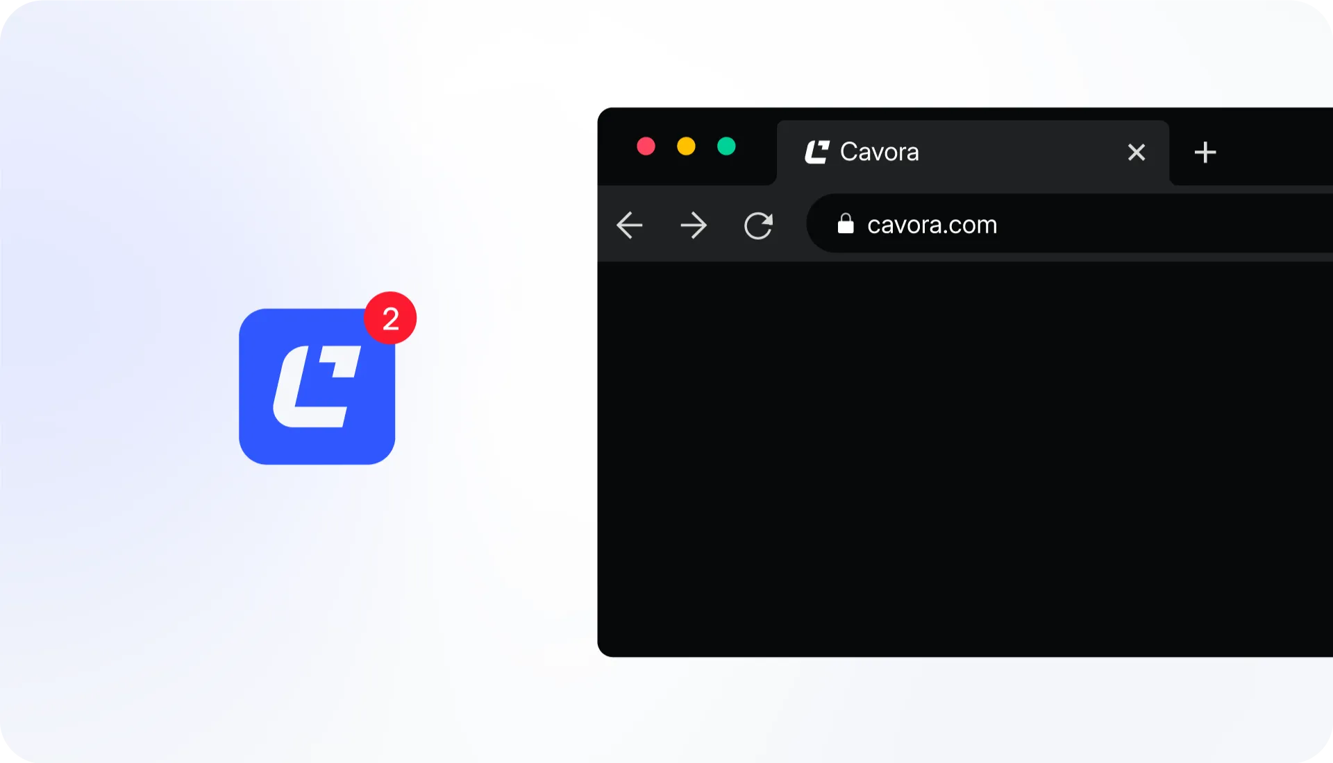
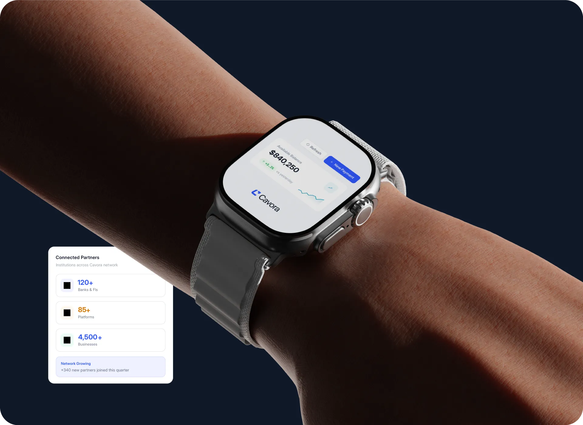
Cavora’s visual identity extends into a clear digital experience designed to make complex financial infrastructure easier to understand. Clean layouts, glass-inspired gradients, confident blue accents, and connected visual elements communicate trust, transparency, and global reach, creating a consistent experience across the website and key digital touchpoints.
Logo Concept
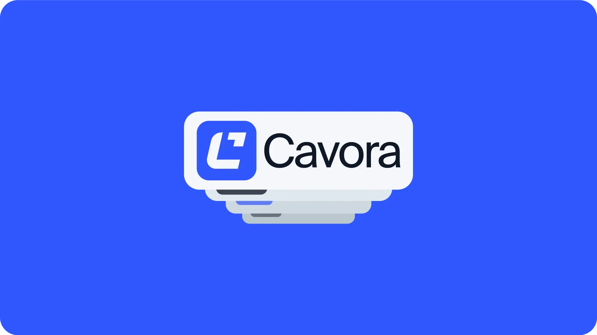
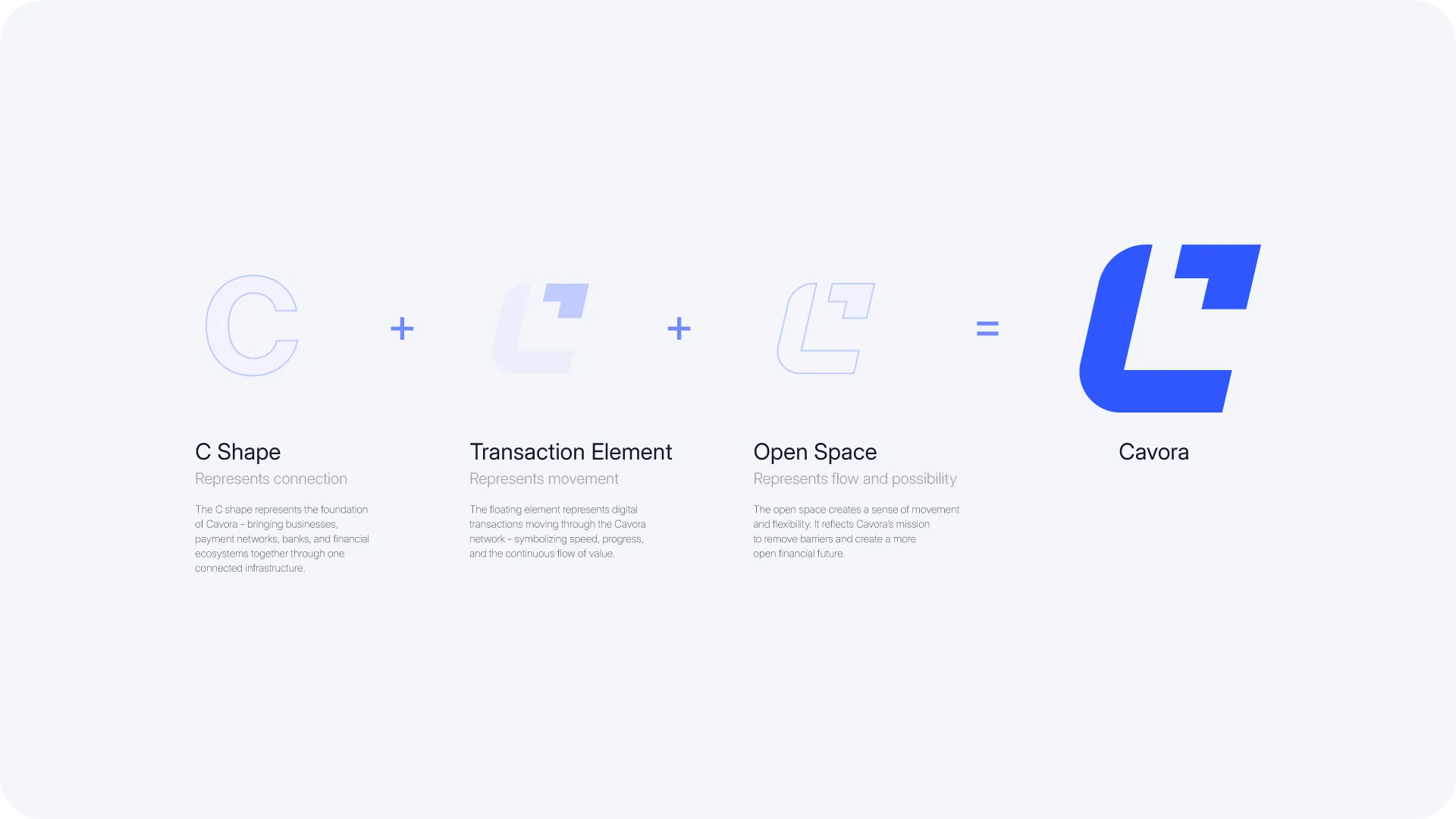
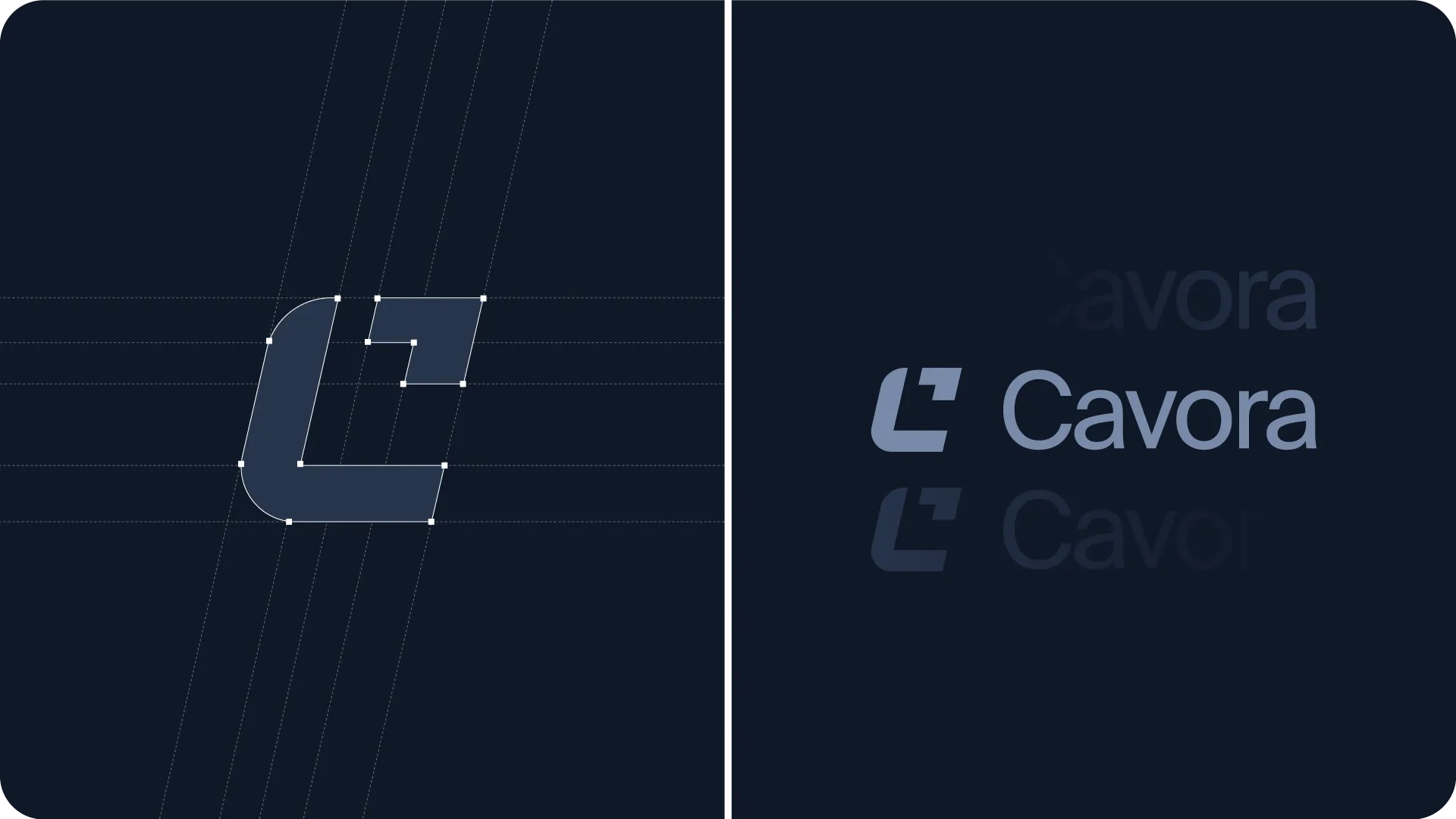
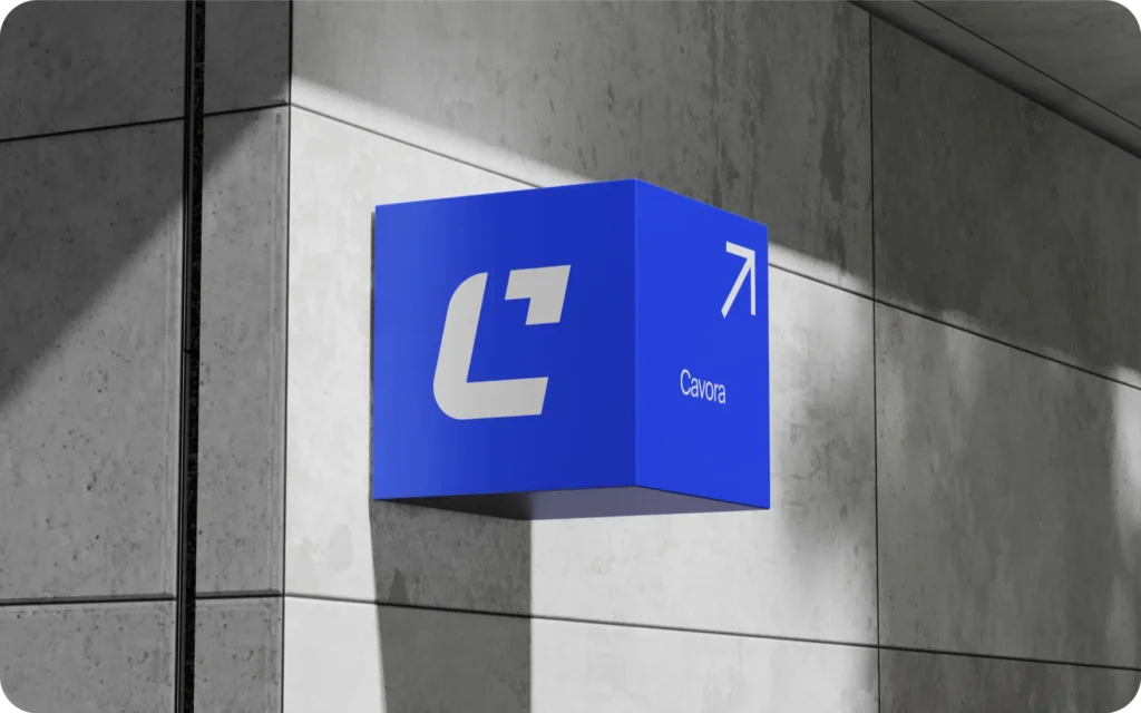
Cavora’s logo was designed to represent connection, movement, and financial possibility. Its distinctive geometric symbol combines a connected C shape, a directional transaction element, and open space to express seamless financial connectivity, continuous progress, and a more open global financial infrastructure.
Design system
We turn complex financial
systems intoseamless
global connections
Printing
Materials
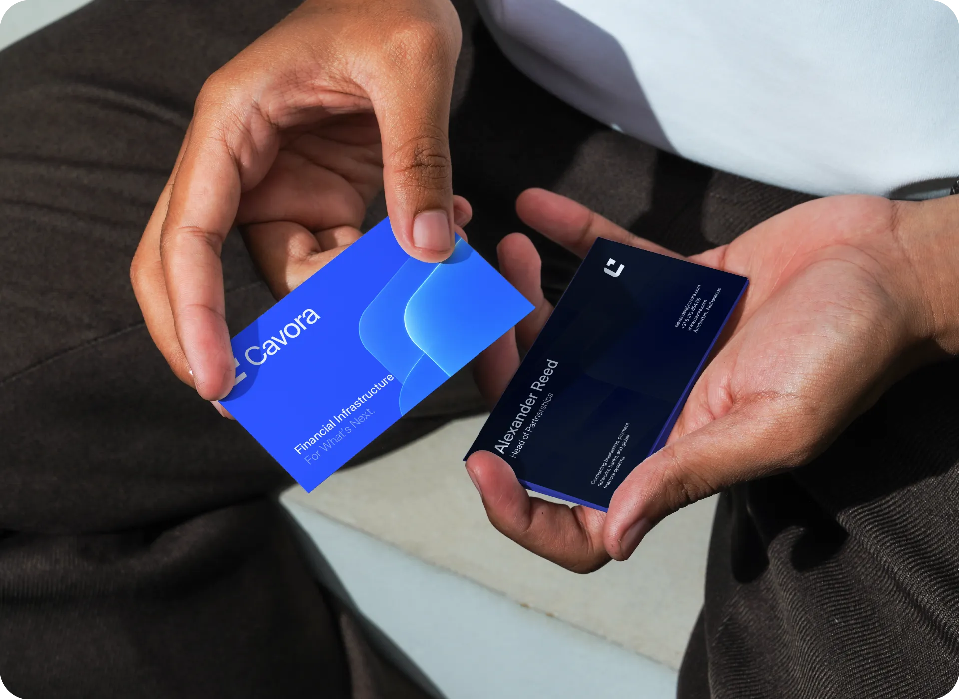
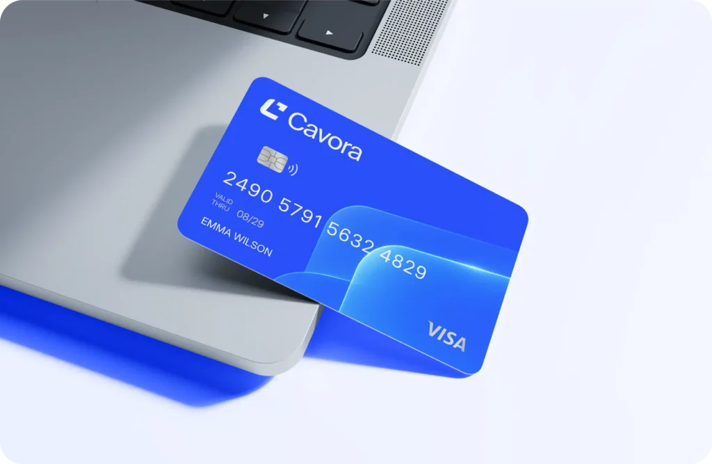
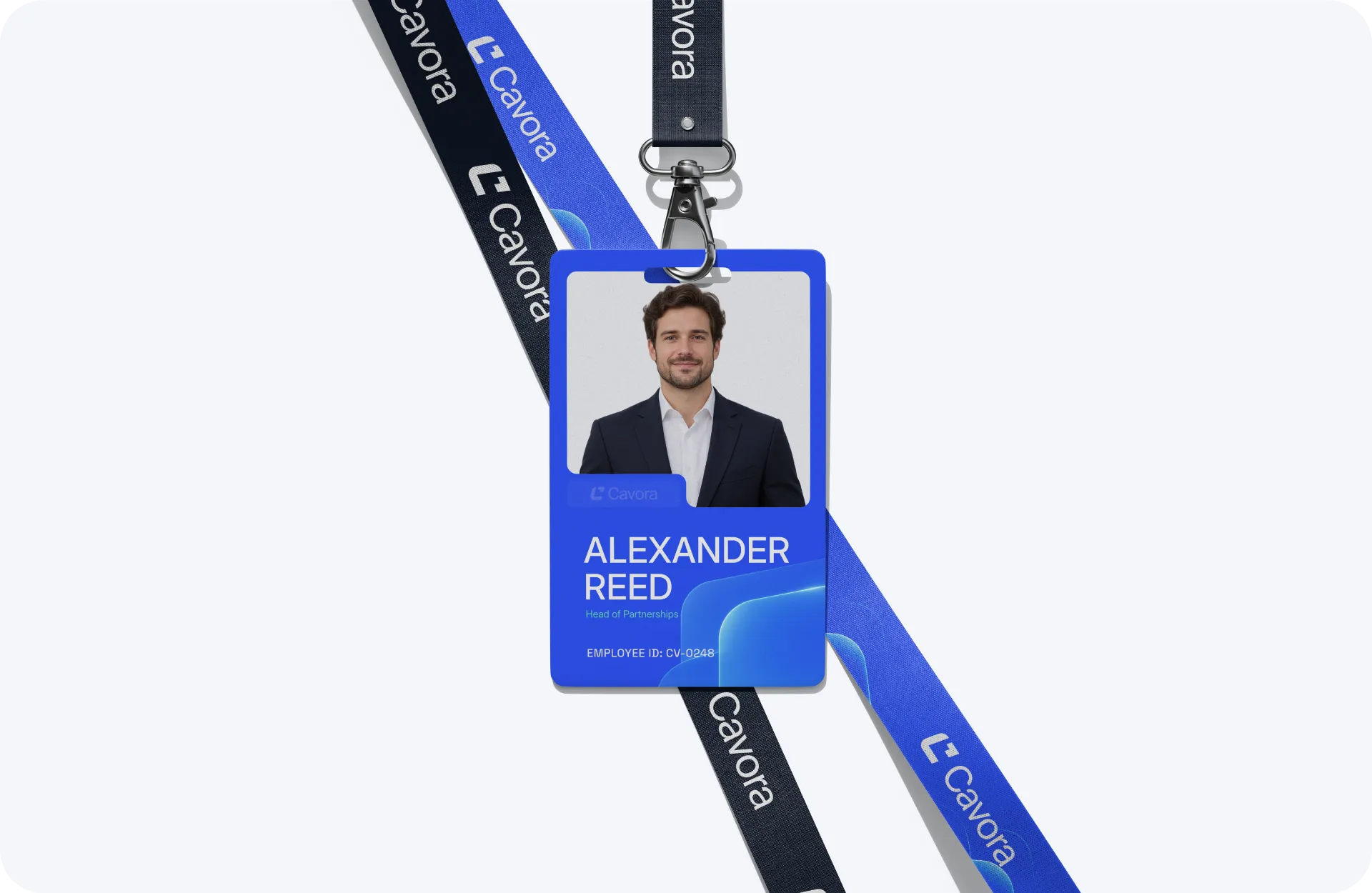
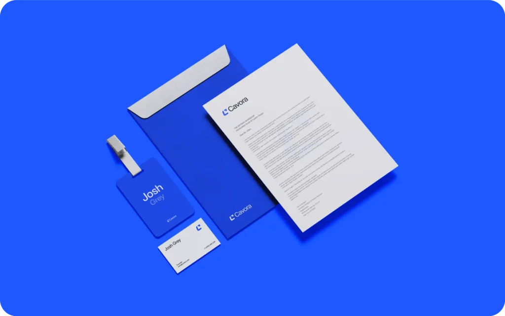
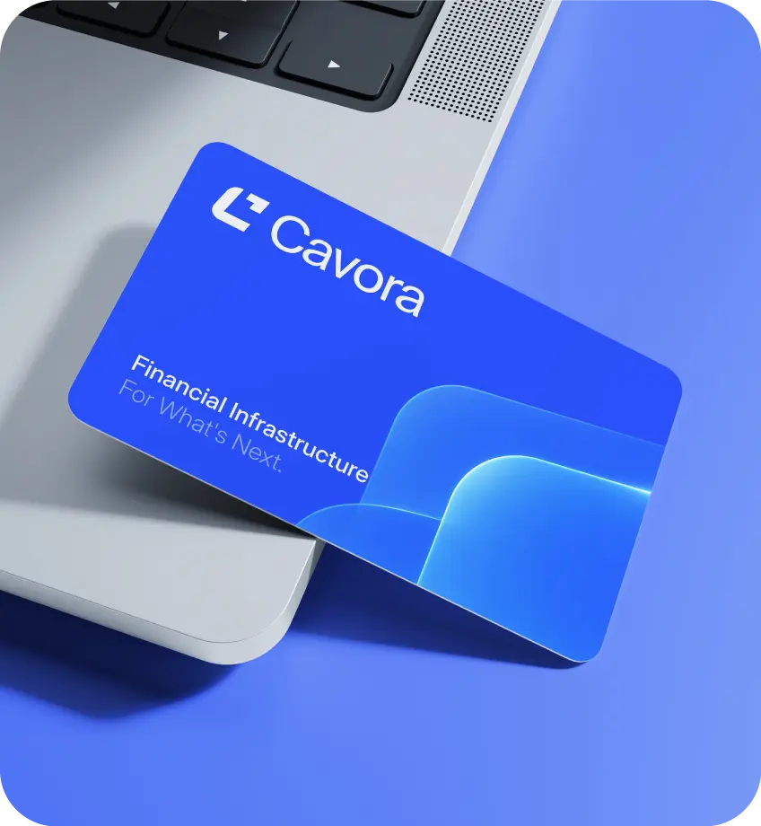
We extended Cavora’s visual identity across business cards and printed materials, bringing its signature blue palette, glass-inspired graphics, and typography into physical touchpoints. This consistency reinforces financial credibility, brand recognition, and trust, ensuring Cavora communicates the same clarity and confidence offline as it does across its digital financial infrastructure.
Social Media
Our goal was to make Cavora instantly recognisable across social channels. We combined clear headlines, natural photography, and signature blue glass-inspired graphics to create a consistent visual system. Each creative communicates financial connectivity and makes Cavora’s complex infrastructure easier to understand, helping build brand recognition and audience interest.
Results
Identity
A DISTINCTIVE FINANCIAL PRESENCE
A distinctive logo and glass-inspired visual language give Cavora a recognisable identity in the financial infrastructure space.
Clarity
MAKING COMPLEX FINANCE CLEARER
Clear messaging and structured visuals simplify how businesses, payment networks, and financial systems connect.
Consistency
ONE CONNECTED BRAND SYSTEM
A unified system of colour, typography, and glass elements creates consistency across every brand touchpoint.
Confidence
DESIGNED TO BUILD TRUST
Deep navy, confident blue, and refined gradients communicate financial credibility, connectivity, and forward momentum.
Related cases
Cavora
Brand identity for a connected financial infrastructure platform
Fintech
Brand Strategy
Visual Identity
TahoPay
Digital payment identity for simple, accessible finance.
Fintech
Brand Identity
Numeric Payment
Modern payment branding for clear, connected transactions.
Fintech
Payment Branding
ZedTech Solution
Technology branding shaped by clarity and digital innovation.
Technology
Brand Identity
Now Accepting New Projects
Ready to Build a Brand That
Matches Your Product's Potential?
Book a free 30-minute discovery call. No commitment.
Just a clear conversation about your brand, your goals,
and whether we’re a fit.
- No commitment required
- Response within 24 hours
- Direct with Rakibul