The Brand Idea
Designed for financial confidence
ROLE
Brand Identity Designer
SCOPE
Strategy & Visual Identity
BRAND DIRECTION
Intelligent Momentum
DELIVERABLES
Logo, Color palette, Typography & Brand Guidelines
THE CONCEPT
FINZED is a digital payments brand concept built around making financial interactions feel simpler, clearer, and more connected. The project explores how a distinctive visual identity can communicate financial confidence and forward momentum through a bold wordmark, a vibrant green palette, and a signature directional data-wave motif.
BRAND POSITIONING
FINZED is positioned as a confident, forward-looking digital payments brand that makes financial interactions feel effortless. Its identity balances the clarity and reliability expected from financial technology with the energy of progress-creating a brand that feels capable, approachable, and built for what's next.
Challenges & Solutions
Problem
Digital payments should feel simple, secure, and effortless, yet financial technology brands can often appear complex or interchangeable. FINZED needed a distinctive brand identity that could communicate financial confidence, make the experience feel more approachable, and stand out in a competitive digital payments landscape. The challenge was to balance the clarity and reliability expected from a financial brand with a sense of energy and forward momentum.
Solution
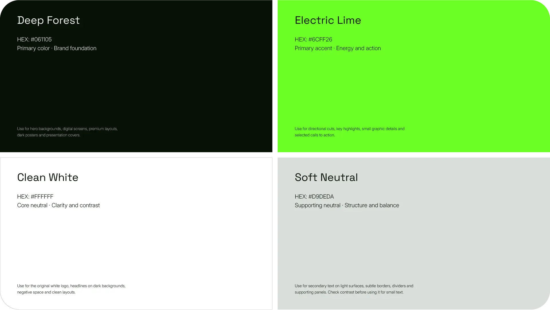
The solution was to build a bold, cohesive visual identity around FINZED’s core idea: financial progress without friction. A distinctive wordmark, a high-contrast palette of deep black and vivid green (#70F52A), and a signature directional data-wave motif work together to express movement, connection, and clarity. Supported by confident typography and a consistent graphic system, the identity gives FINZED a recognizable, contemporary presence while balancing technological energy with financial credibility.
Process
01
Discovery & Strategy
Brand foundation
Positioning & core idea
02
Visual Exploration
Intelligent momentum
Moodboard & art direction
03
Identity Development
FINZED wordmark
Directional data wave
04
Design System & Applications
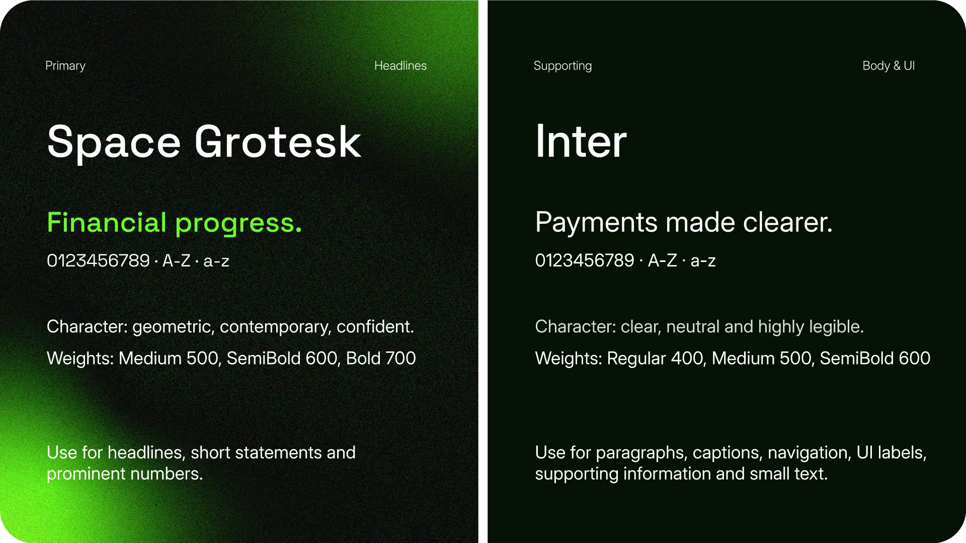
Color & typography
Brand applications
Digital Experience
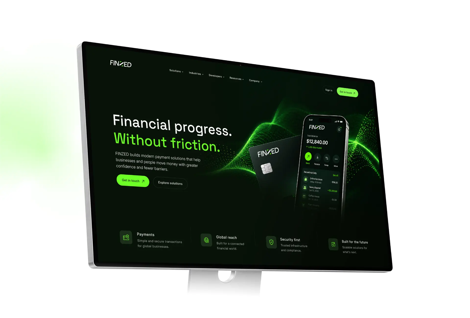
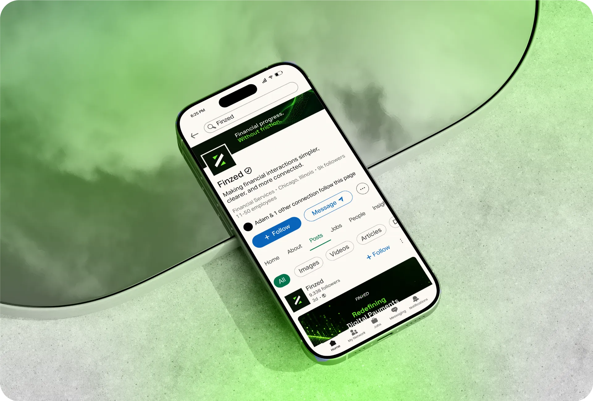
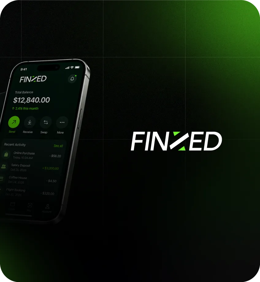
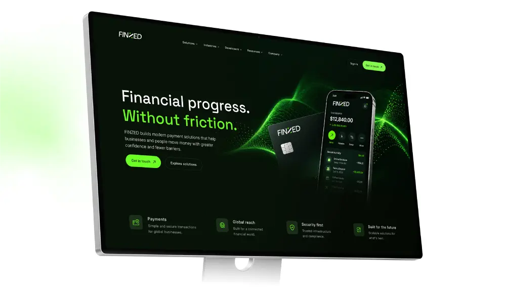
FINZED’s visual identity translates into a bold digital experience built around clarity, financial confidence, and forward momentum. The deep forest background, electric lime accents, and directional data-wave create a cohesive interface that connects the brand’s visual language with its digital presence.
Logo Design
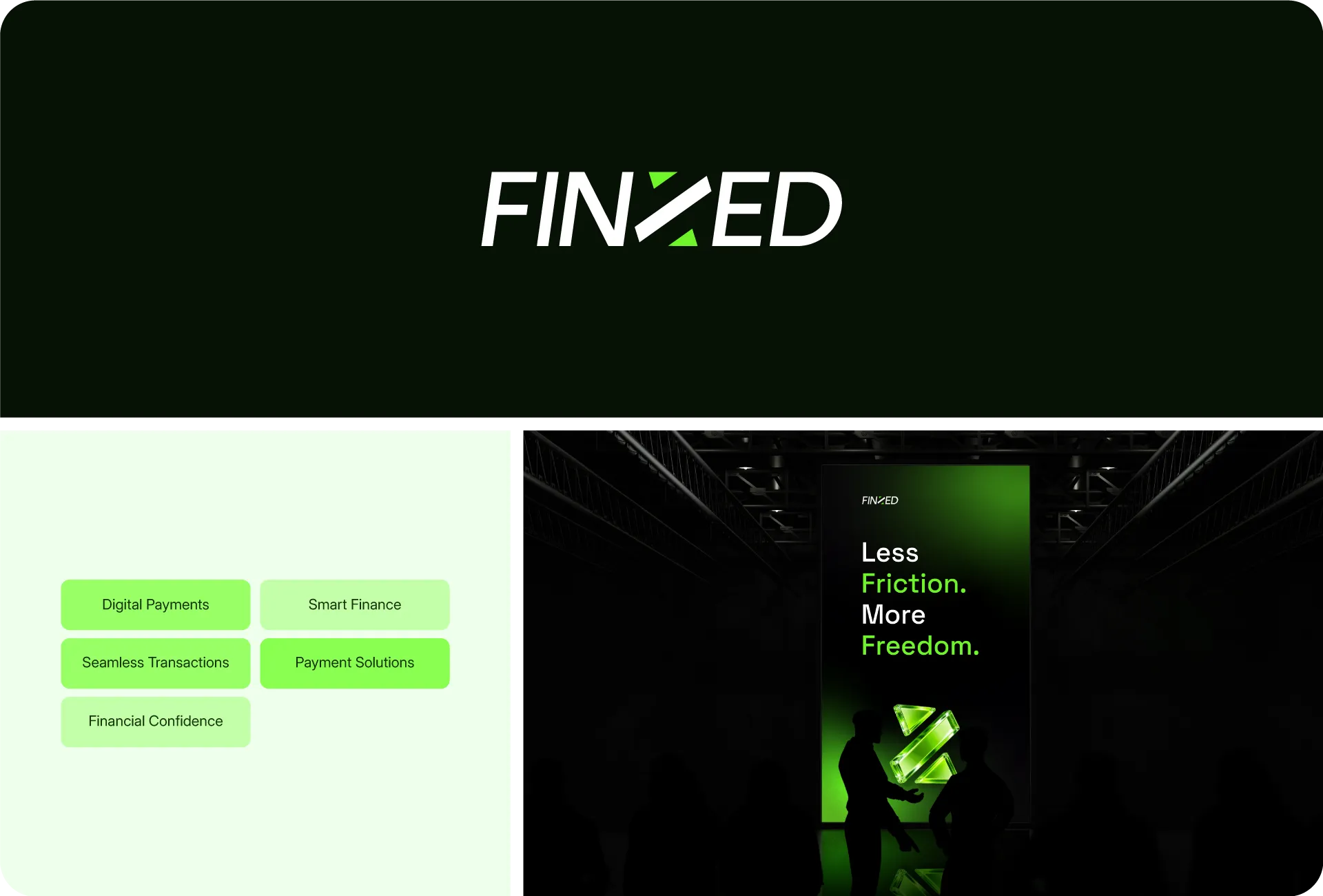
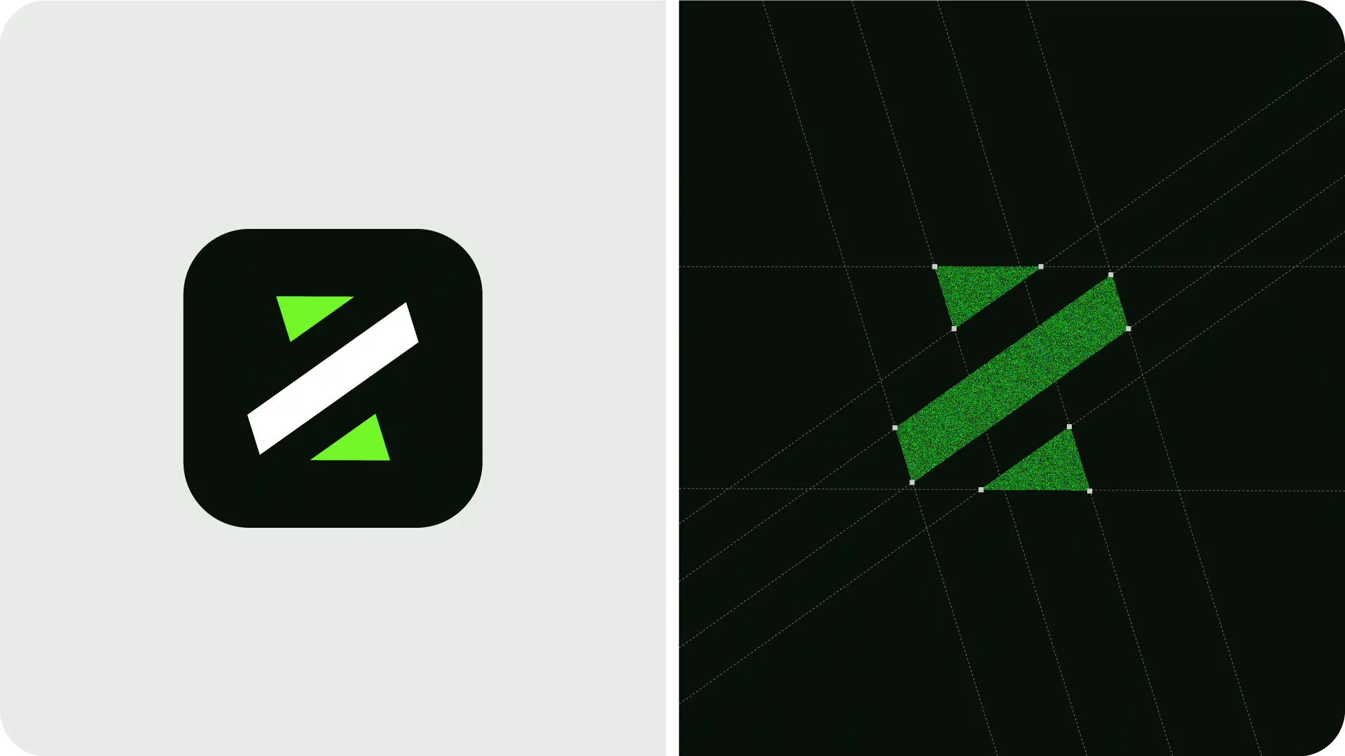
FINZED’s wordmark was designed to express confidence, clarity, and forward momentum. Its bold typography and distinctive directional cut create a recognisable identity for a digital payments brand, balancing financial credibility with the energy of progress.
Design system
Brand Pattern System
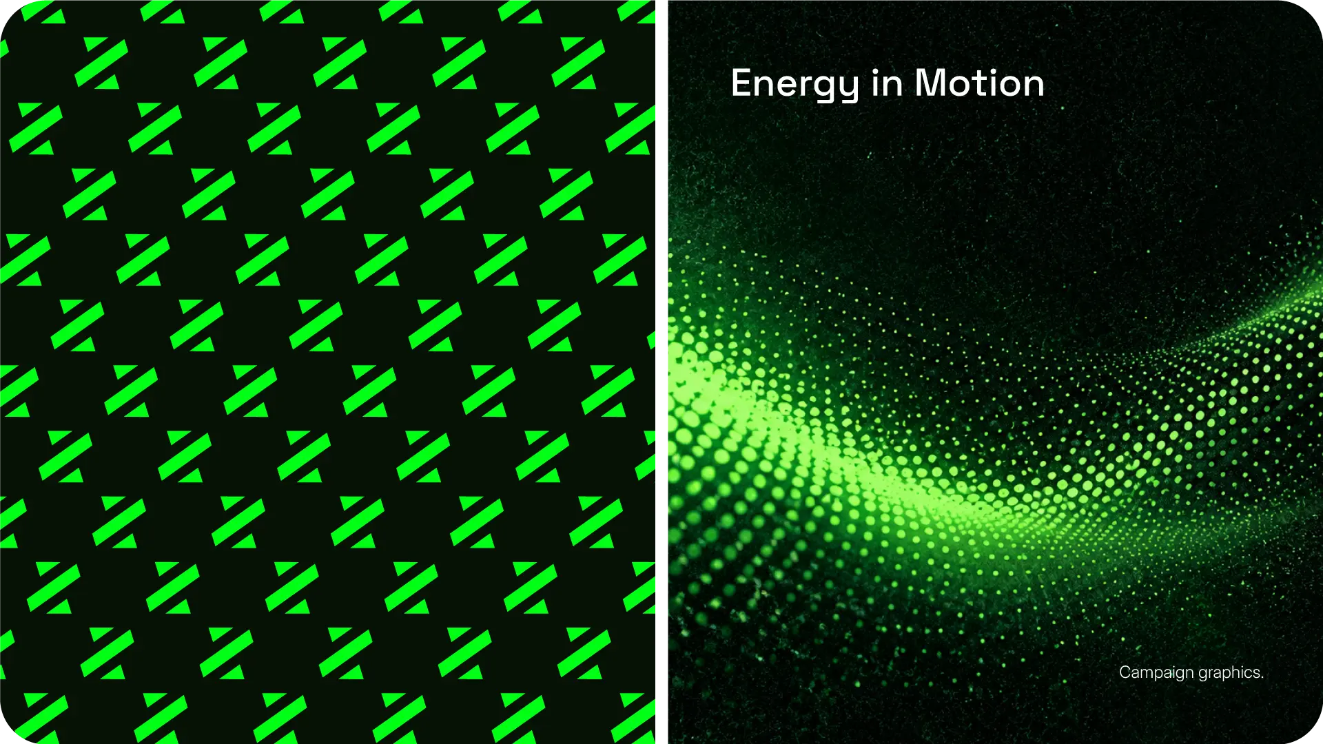
A directional data-wave motif brings FINZED’s visual identity to life. Built from a flowing field of circular dots, the pattern expresses movement, connection, and financial progress through a distinctive graphic language.
We turn financial
complexity into
confident movement
Printing
Materials
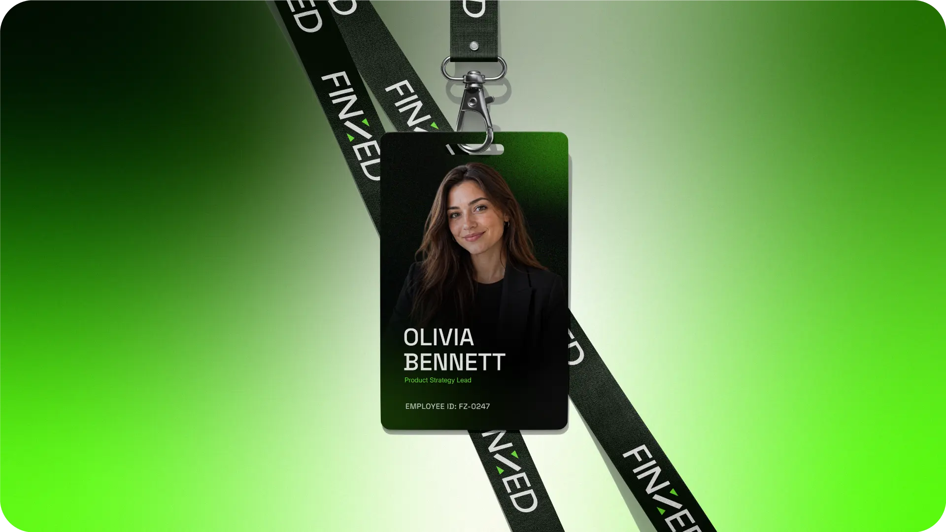
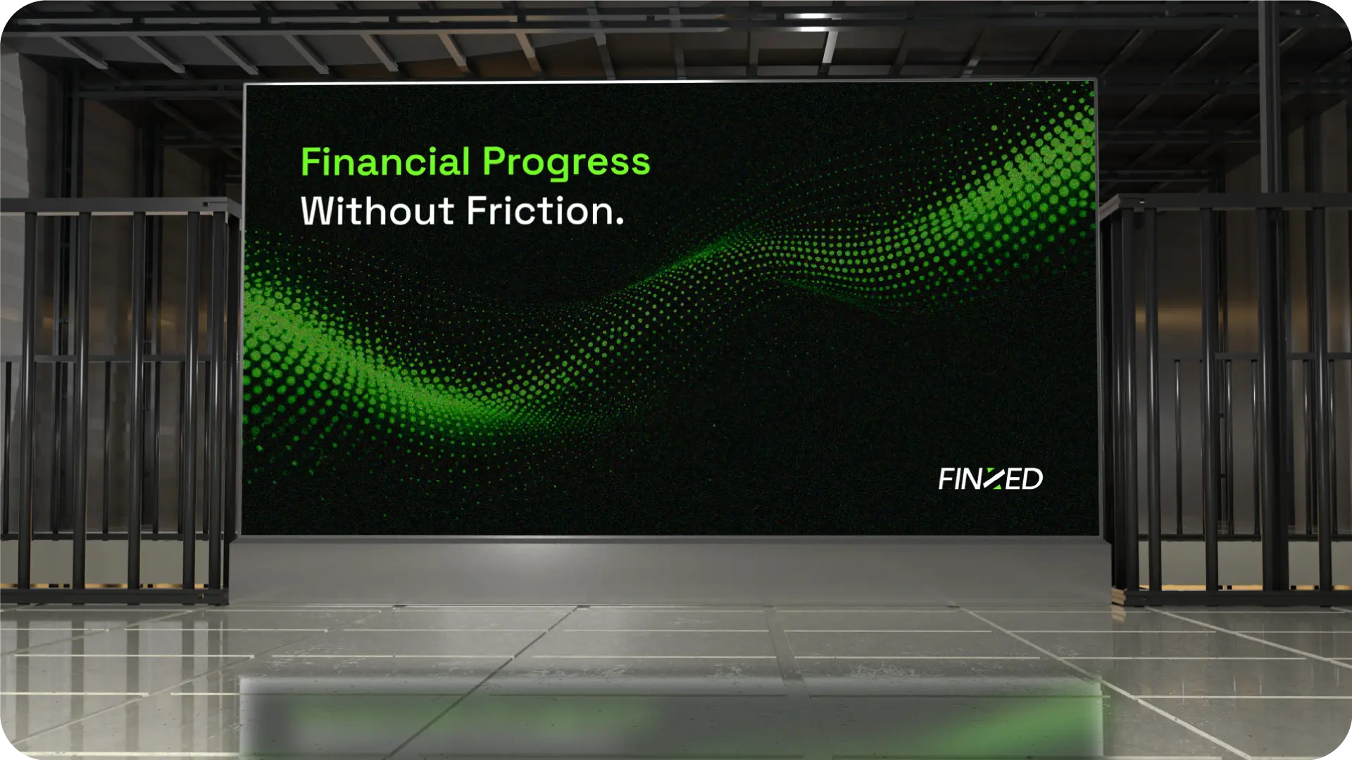
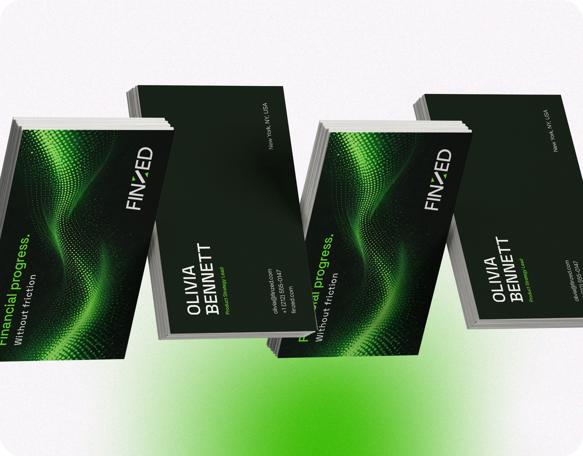
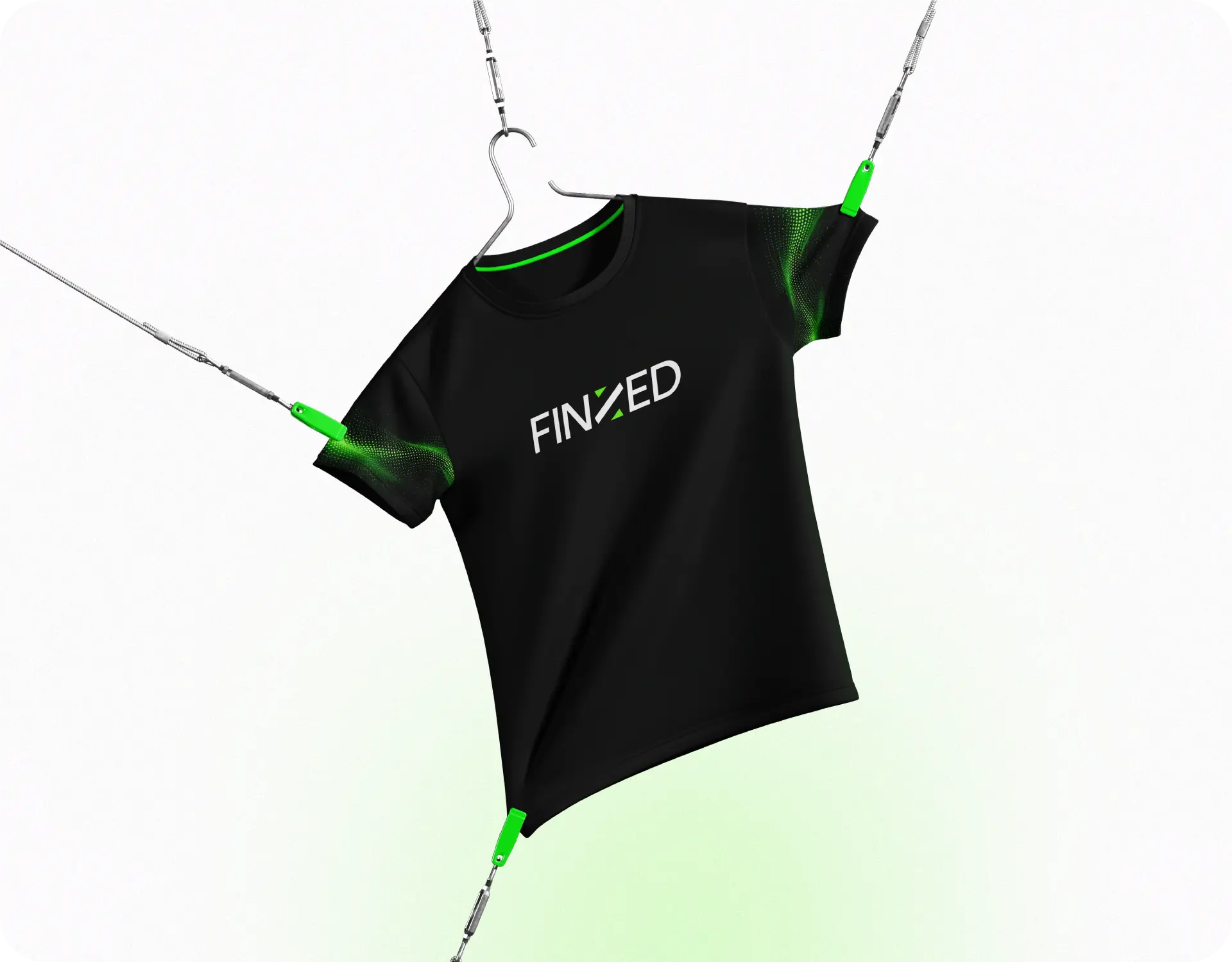
We extended FINZED’s visual identity across outdoor advertising, business cards, and branded materials. The bold typography, deep black palette, and signature electric green data-wave motif create a consistent brand presence beyond digital platforms. Each physical touchpoint reinforces financial credibility, brand recognition, and trust wherever the brand appears.
Social Media
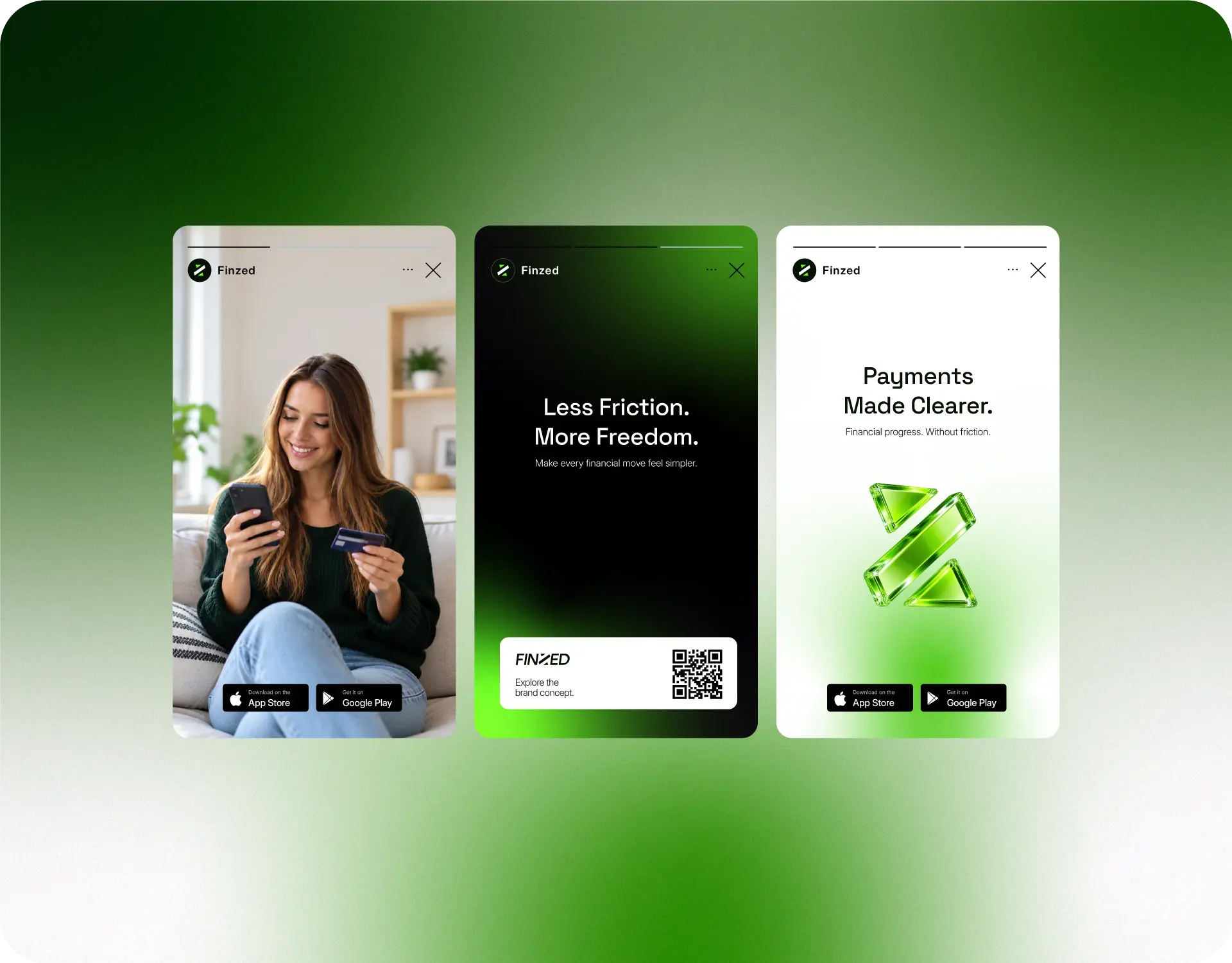
Our social media direction was designed to make FINZED stand out in crowded digital feeds. We combined benefit-led headlines, authentic lifestyle photography, and distinctive 3D brand elements to create a recognisable visual system. Consistent use of deep black, electric green, and bold typography helps communicate financial simplicity, strengthen brand recognition, and encourage potential users to explore the platform.
Results
Identity
A distinctive visual presence
A bold wordmark and distinctive visual language give FINZED a recognizable presence in digital payments.
Clarity
Making finance feel simpler
Clean typography and focused messaging make financial interactions feel simpler, more intuitive, and accessible.
Consistency
One cohesive brand system
A unified system of colour, typography, and graphic elements keeps the brand cohesive across every touchpoint.
Confidence
Designed to inspire trust
A balance of deep forest tones, electric lime, and purposeful design communicates credibility, energy, and forward momentum.
Related cases
Finzed
Brand identity for a digital payments platform
Fintech
Visual Identity
TahoPay
Digital payment identity for simple, accessible finance.
Fintech
Brand Identity
Numeric Payment
Modern payment branding for clear, connected transactions.
Fintech
Payment Branding
ZedTech Solution
Technology branding shaped by clarity and digital innovation.
Technology
Brand Identity
Now Accepting New Projects
Ready to Build a Brand That
Matches Your Product's Potential?
Book a free 30-minute discovery call. No commitment.
Just a clear conversation about your brand, your goals,
and whether we’re a fit.
- No commitment required
- Response within 24 hours
- Direct with Rakibul