Why This K Logo is Unique
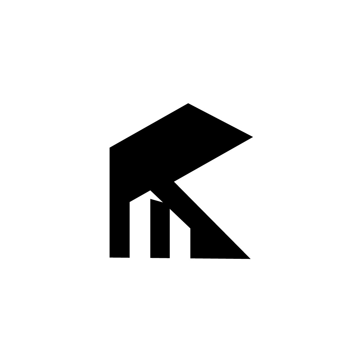
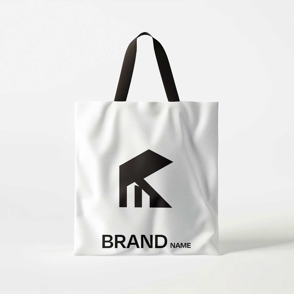
One reason this k real estate logo is unique is the way it combines a letter and an industry symbol in one design. Many real estate logos only show a house icon. Some only show a letter. This design mixes both together in a creative way. The result is a logo that looks professional and distinctive. It helps the brand stand out from competitors. The geometric structure also gives the logo a modern and premium feeling.
The black color makes the logo look strong and confident. Black is often used in professional branding because it represents authority, stability, and trust. These qualities are very important in real estate businesses. Clients want to work with companies that feel reliable and secure. A strong and simple logo helps build that trust. The design also works well in other colors such as dark blue, gold, or gray. This makes it flexible for different brand styles.
Why Will Match With Your Business
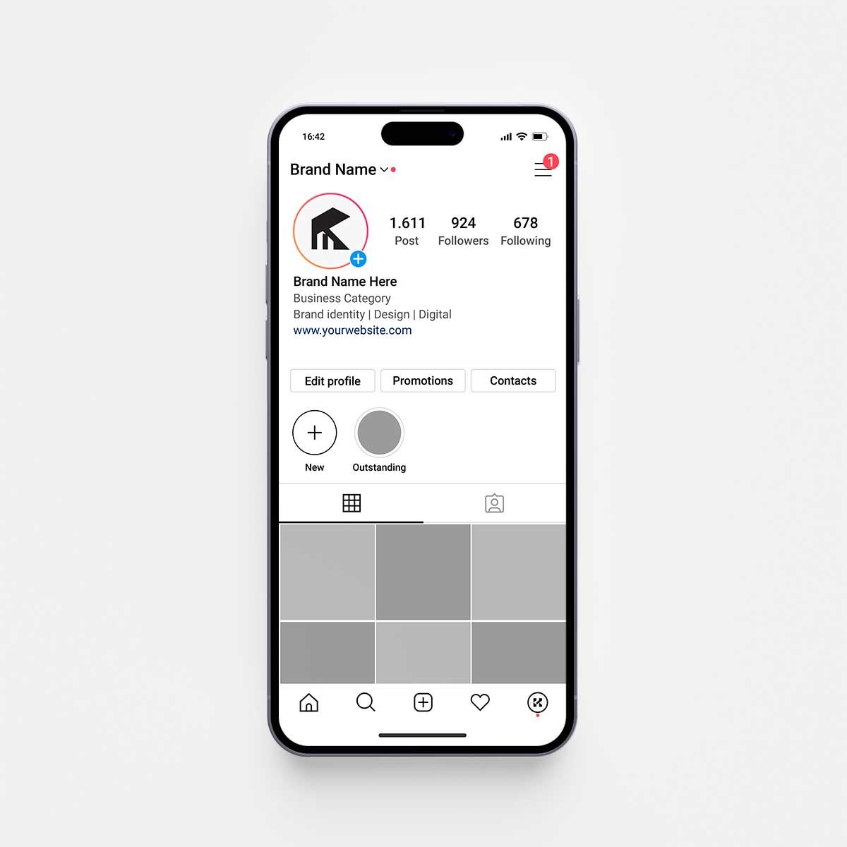
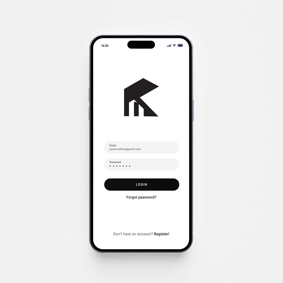
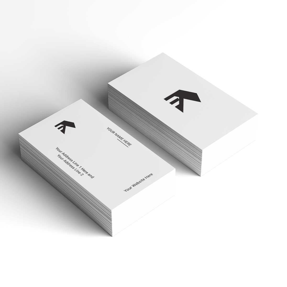
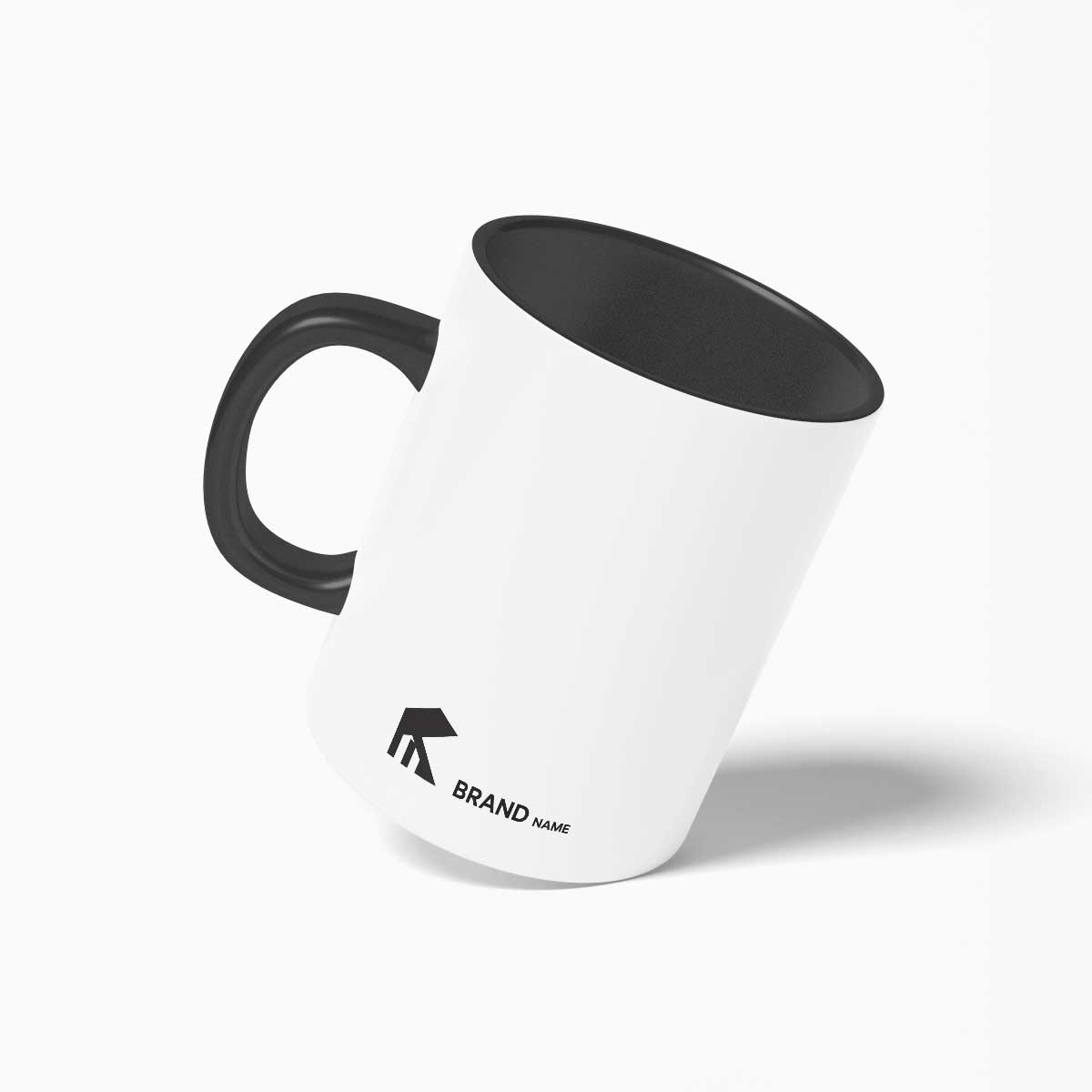
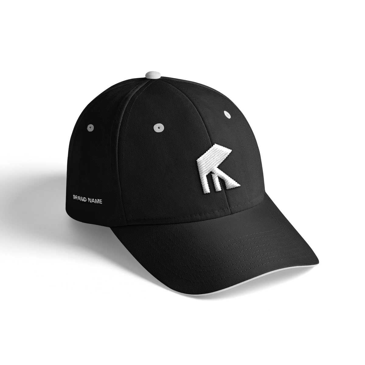
Another great feature of this real estate logo ideas is its versatility. The design is clear and balanced. It works well in small sizes and large sizes. This means it can be used easily on websites, property signs, social media, business cards, office branding, and marketing materials. The simple shape makes it easy to print and easy to remember. In branding, simple logos are often more successful because people can recognize them quickly.
This logo is a great match for real estate companies, property developers, housing agencies, construction businesses, architecture firms, and property investment brands. It is especially powerful for businesses that start with the letter K. The letter in the logo helps connect the symbol with the company name. This makes the brand identity stronger and easier to remember.
The k real estate logo represents stability, growth, and professionalism. It shows that the business is modern and trustworthy. A strong logo like this can help a company build a confident brand image and stand out in a competitive market.
Why You Should Get This Logo
- Modern and professional k real estate logo
- Creative mix of letter K and house shape
- Unique and memorable design
- Perfect for real estate and property businesses
- Clean geometric and minimal style
- Works in black and other brand colors
- Clear in small and large sizes
- Strong and trustworthy brand identity
See Some other Ready-made logo

