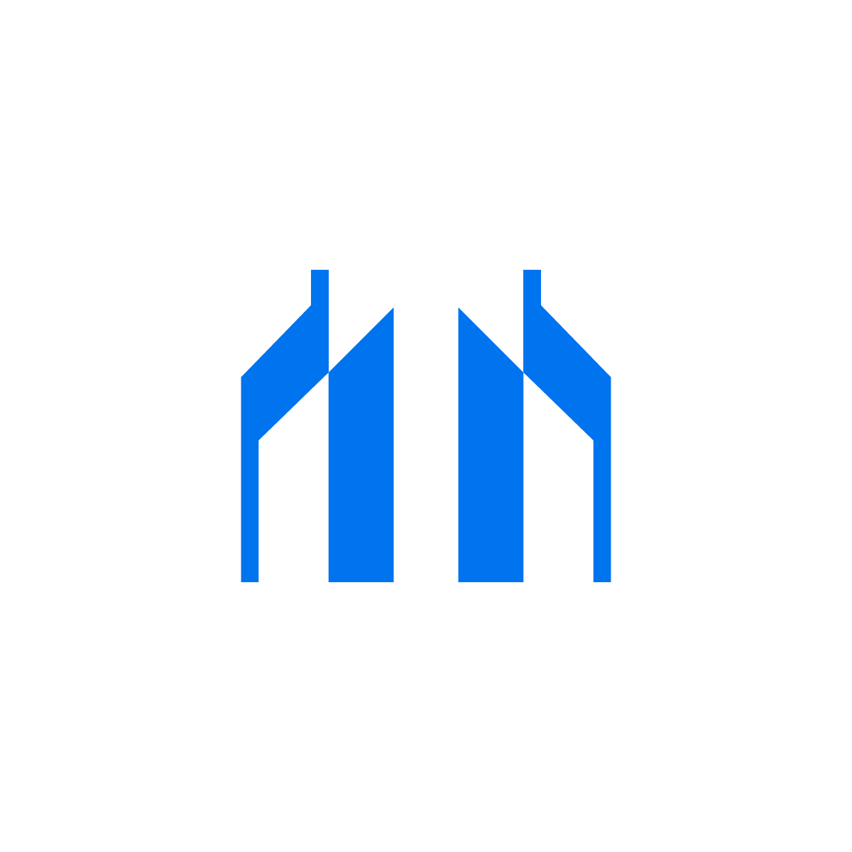
Why This M Building Logo Is Special
- Two Meanings in One Design
This logo is smart. It looks like the letter “M”, but also like two buildings. So it can stand for your company name and your industry at the same time. For example:- “M” for Modern
- “M” for Metro
- “M” for Management
- Clean and Modern Look
The design is very simple. No extra details. Just sharp lines and strong shapes. This gives a modern and professional feeling. It tells customers that your company is serious and reliable. - Good Color Choice
Blue is a strong color. It means trust, safety, and confidence. Many big companies use blue for this reason. It works very well for building, housing, and design businesses. - Balanced and Symmetrical
The logo looks the same on both sides. This balance gives a feeling of stability and strength. It’s a good message for customers who want a solid and safe service. - Easy to Understand
Even though the logo is modern, people can still see what it means. It looks like two tall towers and the letter M. This is good because people remember it easily.
Why You Should Buy This Logo
- Looks Professional
This m building logo will make your company look smart and serious. It tells people you are good at what you do. - Perfect for Many Businesses
This logo is great for:
Real estate companies
Construction companies
Architecture firms
Property management
Urban projects
Investment businesses in housing - People Will Remember It
The simple shapes and smart idea make it easy to remember. Customers will recognize your brand quickly. - Good for Any Use
This logo works on:- Business cards
- Websites
- Building signs
- Company uniforms
- Flyers or brochures
- Social media
- Easy to Change and Use
You can use this logo in many colors or sizes. It still looks good. You can also add a name or slogan under it. - Saves Time and Money
You don’t need to hire a designer. This logo is ready to use. It is already clean and finished. - Only for You
This is not a copied logo. It is original. When you buy it, it becomes part of your brand.
The M Building logo is strong, smart, and simple. It shows your business is about buildings, housing, or design. It is also easy to remember and use everywhere.
If your company name starts with M, this is a perfect match. But even if it doesn’t, the design still works well because it looks like tall, strong buildings.
This logo helps people trust your company. It gives a message of quality, safety, and modern style.
See some other Ready-made logo


