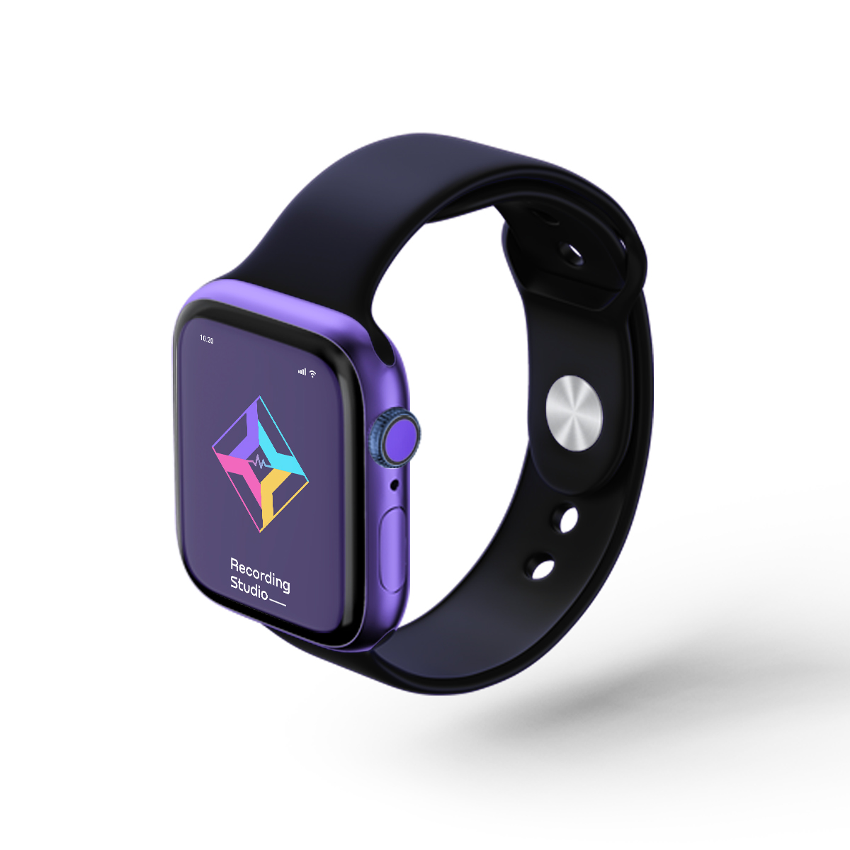
This recording studio logo is easy to understand, colorful, and looks professional. The design is simple but strong. It shows that this studio is modern and creative.
Recording Studio Logo Colors
The logo has four colors: purple, blue, pink, and yellow. These colors are bright and stand out. When people see bright colors, they feel happy and excited. This will help them remember your studio.
Bright colors also show that the studio is up-to-date. It shows that you are using the latest tools and ideas for recording. These colors give a positive feeling about your business.
Simple and Clean Design
The logo design is simple and clean. This makes it look very professional. It uses straight lines and smooth shapes. This is important because a clean design shows that the studio is serious about its work.
People will trust your studio because the logo looks strong and reliable. The simple design also makes it easy to remember. When people see this logo, they will think of your studio right away.
Focused on Music and Sound
In the center of the logo, there is a small sound wave symbol. This shows that the studio works with music and sound. It’s a clear symbol that tells people what your studio does.
This is a good choice because it is simple and direct. When people see this logo, they will know right away that your business is about recording sound and music.
Easy to Read Text
The words “Recording Studio” are written in a bold, clear font. The letters are big and easy to read. This is important because it makes the logo easy to understand for everyone.
You can add your studio’s name after the word “Studio.” This makes the logo personal for your business. A clear font like this helps people know that your studio is professional and serious.
For New and Experienced Clients
This logo is good for everyone. If someone is new to recording, the bright colors and simple design will make them feel welcome. The clear text will help them feel confident that this is the right studio for them.
For people with experience, the clean and professional look shows that the studio is serious. The sound wave symbol tells them that the studio knows a lot about music and recording.
Why This Logo Stands Out
Many recording studios use the same types of logos. They often show musical instruments or microphones. But this logo is different. It uses bright colors and modern shapes to stand out.
This makes your logo unique and easy to remember. In a business like recording, it is important to be different. A unique logo will help more people notice and remember your studio.
How This Logo Can Help Your Business
This logo can make your business better in many ways:
- Make Your Studio Known: A bright, easy-to-remember logo will help more people know about your studio.
- Build Trust: A clean and professional design shows that your studio is reliable. Clients will trust you with their important projects.
- Attract New Clients: The modern design will bring in new clients. People will feel excited to work with your studio.
- Encourage Action: The bright design and easy words make people want to book a session or visit your website.
Where to Use This Logo
You can use this logo everywhere. It will look good on your website, social media, business cards, and signs. It works well online or in print.
The bright colors and simple design will stand out online, helping you get more visitors to your website. It will also look good on small things like social media icons or T-shirts.
Check out another creative s monogram logo


