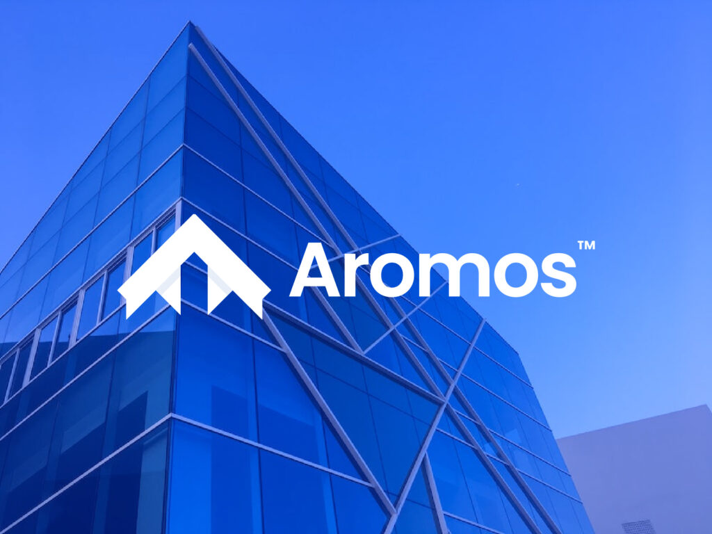
This real estate logo tells a story of trust, professionalism, and a commitment to creating the perfect space for every client. The design features a sleek, modern house icon paired with initial letter A for “Aromos” and bold typography that communicates strength and reliability. The use of clean lines and geometric shapes symbolizes the precision and attention to detail that the company applies to every project they undertake, whether it’s selling homes, finding the perfect property, or providing expert advice.
The choice of colors in the logo plays an important role in conveying the brand’s values. The calming blue tones represent stability, security, and professionalism – qualities that clients can rely on when making such an important decision as purchasing a home. The subtle hints of gold or metallic accents bring a touch of luxury, hinting at the premium service that the real estate company offers, as well as the idea that each property is a valuable investment.
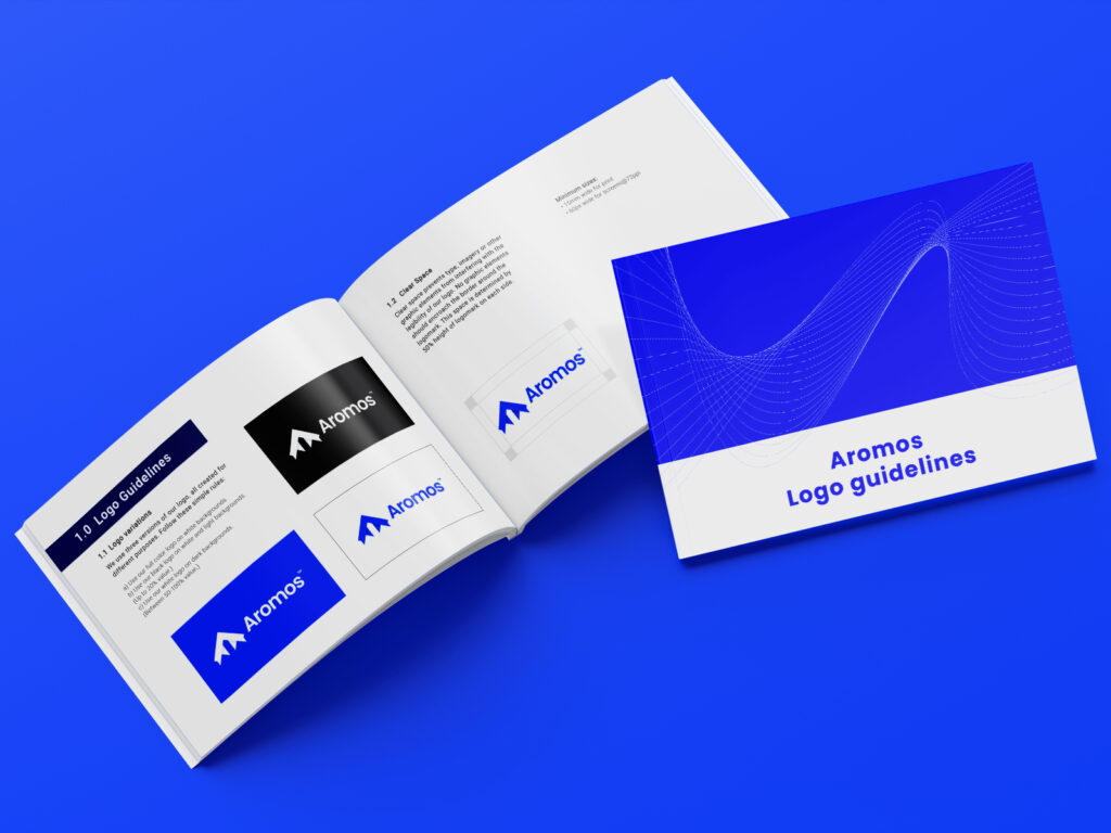
The logo’s simplicity ensures it remains memorable and versatile, working well across a variety of platforms – from business cards and letterheads to online listings and large billboards. This adaptability reflects the company’s ability to meet clients wherever they are in their real estate journey, providing them with consistent and reliable service at every touchpoint.
Buy logo today for your startups, businesses or agencies.